

Completed Primary Logos Including: Radiance Deluxe Matches, Horizon Landscape Photography, Honey & Hibiscus Skincare, Forge Shipping, Tiny Treasures Baby Clothes, Gem Burst Crunch Cereal, Celerity Delivery Service, Echo Messaging App, and Rae Natale Monogram Logo.
"Igniting the Semester-long Project"
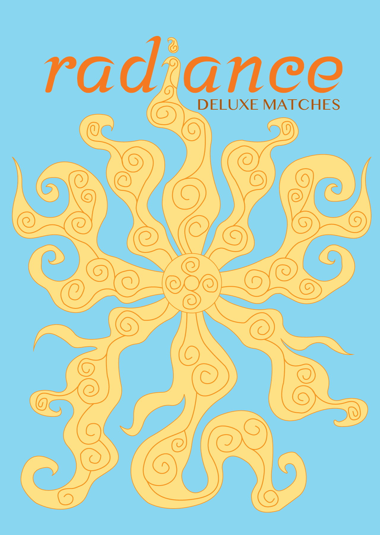
Objective: to develop the branding for a box of matches with the freedom to choose a name for this fictional company, but it should be short and suggestive of the product's purpose.
Specific Guidelines: include the tagline "Deluxe Matches" or "Luxury Cedar Matches".
Inspiration: for this assignment I got inspiration from the movie "Tangled" and the sun crest. I wanted it to look flowy like how a flame would with intricate detailing. I decided to name my brand "Radiance" because it means to emit light and goes along with the action of lighting a match.


"Smile and Say Cheese!"
Objective: to create a unique identity for a photographer or their photography studio and come up with a brand that reflects the essence of the photographer or studio to capture the attention and curiosity of potential clients.
Specific Guidelines: minimum of 1 color logo and a maximum of 4 colors.
Inspiration: for this assignment I wanted to focus on a landscape photography company since those are the type of photos I enjoy taking the most. I chose the name "Horizon" because a common aspect of landscapes is capturing that horizon line where the sky meets the land. While designing my logo I thought it would be unique to play around with the "i" making the sun act as the dot.


"Luxury in a bottle. Premium Skin Care Products"
Objective: to create the identity for a high-end skincare client seeking a new name and brand identity
Specific Guidelines: Mono-line preference with no wordmark or letterform brandmarks.
Inspiration: I wanted to do something floral related and one of my favorite flowers is the hibiscus. I wanted my brand name to have alliteration which is where honey came along. While designing I realized a honey comb stick looks similar to the staminal column/pistil (middle of the hibiscus) so I decided to incorporate that into the overall design.


"Welcome to the Industrial Side of Design"
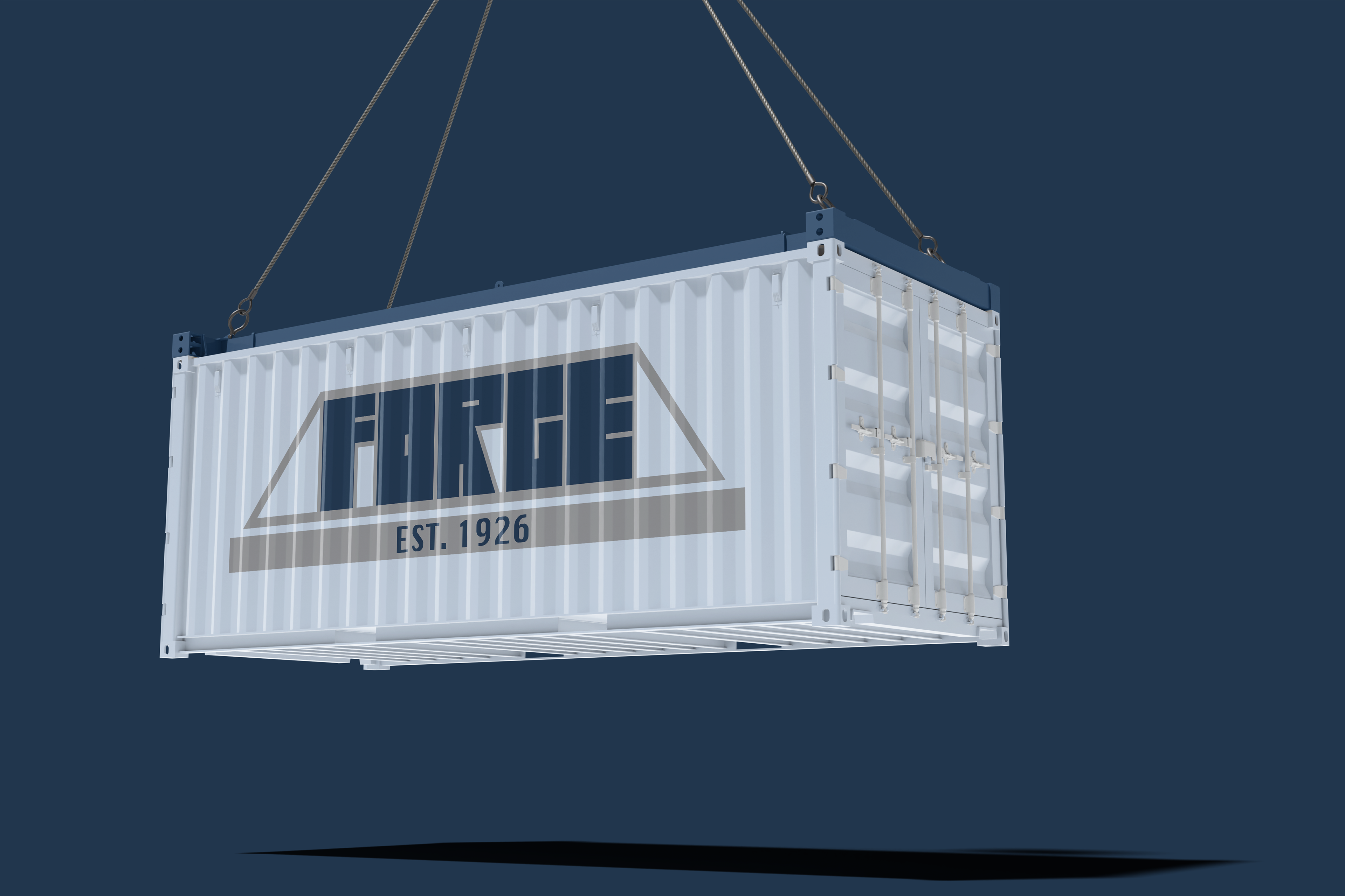
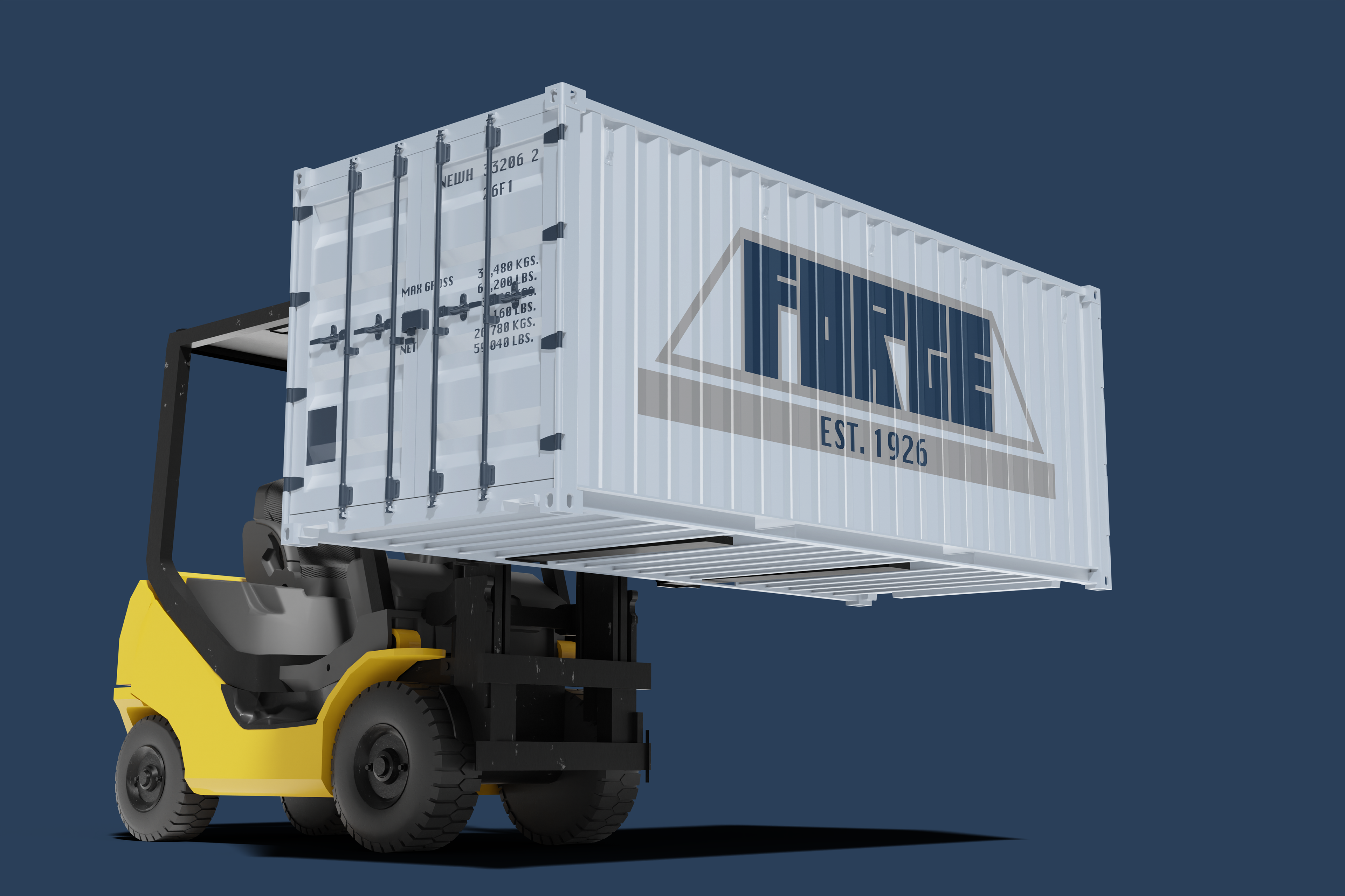
Objective: to spearhead the rebranding of a national shipping company deeply rooted in a single, localized US town (designer's choice - New Hope, PA).
Specific Guidelines: established in 1926 and a new look that reflect and honors their historical roots.
Inspiration: I decided to base my campany in New Hope, PA. I started to do research in hopes of finding a key element located in New Hope to incorporate into my design. I found that New Hope, PA was an important transportation hub with its prime location across the Delaware River. That is why I included the New Hope-Lambertville Toll-Supported Bridge surrounding the brandname. I named my company "Forge" because it can mean to create or build something through effort/time.

"Aw so cute!"
Objective: to develop a unique brand for infant clothing, offering top-quality 100% cotton garments for new parents/guardians exuding a sense of fun, vibrancy, and approachability.
Specific Guidelines: minimum of 2 color logo.
Inspiration: I wanted to do something underwater themed. Many kids clothing have puns or cheesy jokes so I wanted to reflect that in my design. I loved the idea of a clam and then adding on the shirt "The Happiest Clam." I chose the name "Tiny Treasures," because shells/clams are considered treasures of the sea and of course children are precious to their loved ones.


"Grab a bowl and dig in!"
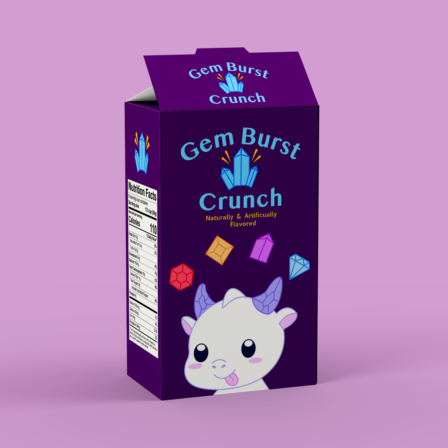
Objective: to come up with a unique and eye-catching name for the cereal brand, along with a logo and overall branding that represents the company's values (Big Cereal Inc.) and target audience (Child Demographic).
Specific Guidelines: consider the practical aspects of packaging design as well, such as nutrition information, ingredients list, and any other required details.
Inspiration: I knew a key part of this design would be having a playful mascot. I decided on a dragon and focusing on the fantasy aspect with crystals. The idea is that the cereal would be shaped like different crystals and each one would be a different color referring to their specific fruity flavor.

"The Postal Service Prompt"
Objective: to design a professional logo for a new delivery service that rivals established companies like FedEx, UPS, and USPS.
Specific Guidelines: avoid using colors commonly associated with established delivery companies and must include an established year as well as a tagline.
Inspiration: for this logo I started off looking for words relating to speed and the action of doing something quickly. I wanted the name to reflect this idea because that is what I feel is an important aspect of delivery services that people look for. I found the word "celerity," which means swiftness, speed, or rapidity of motion and action.

"Let's talk! On second thought..."
Objective: to create branding for the next big messaging service app with a short, tech-friendly name, similar to Chatter, InstaChat, or Messenger.
No Specific Guidelines
Inspiration: I decided on the name "Echo," because it has a tech-friendly feel and can be related to the action of talking/sharing thoughts or ideas. The letter "e" looked like it could be transformed in a way to make it look like a person speaking. Green is a common color used in many messaging apps so I decided to pair it with another color that would help it pop but still stand out from other popular apps.


"Free-form Letterform"
Objective: to create a 1 Letter Monogram logo (aka a Letterform) for a client of choice and develop a brandmark that is clearly the first initial while also incorporating visual elements.
No Specific Guidelines
Inspiration: I wanted to create a logo for my grandmom. I took inspiration from her basement because it is completely covered in all things cheetah, jaguar, and tiger print. Due to her loving animal print I knew it would make sense for her logo to incorporate those different prints into her first initial for her letterform.

